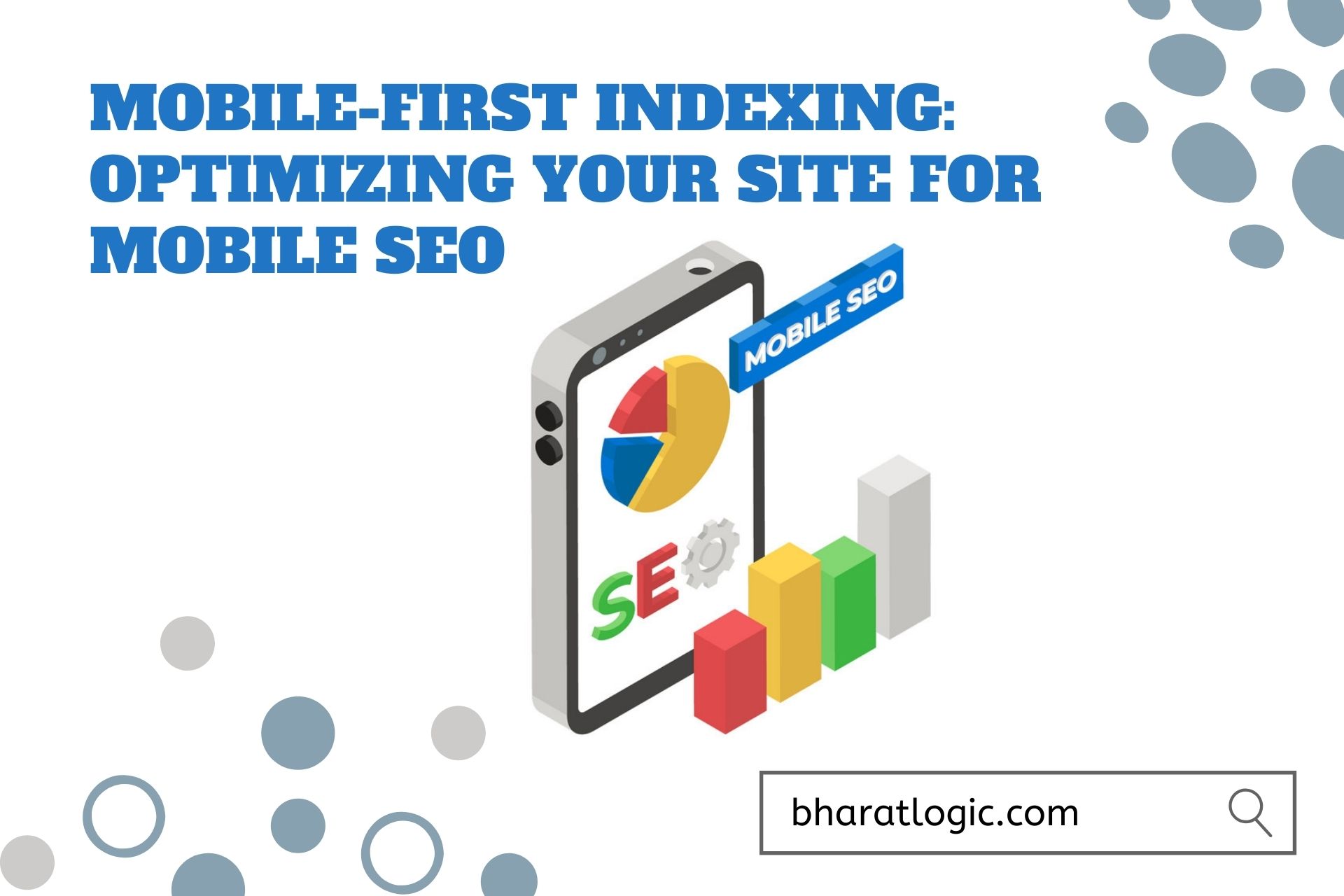
Mobile-First Indexing: Optimizing Your Site for Mobile SEO
Introduction to Mobile-First Indexing
Mobile-first indexing is a pivotal concept in the ever-evolving realm of search engine optimization. With mobile devices taking center stage in the digital landscape, understanding the fundamentals of Mobile-First Indexing becomes paramount. In this section, we’ll delve into what Mobile-First Indexing means and why it matters, setting the stage for an exploration of mobile SEO’s vital components.
Understanding Mobile-First Indexing
-
Definition of Mobile-First Indexing
Mobile-first indexing is a critical concept in the ever-evolving realm of search engine optimization. In a world where mobile devices have become the go-to choice for internet access, Google introduced Mobile-First Indexing. This indexing method prioritizes the mobile version of websites over their desktop counterparts. It means that Google predominantly uses the mobile version of a site’s content for ranking and indexing, affecting how your website appears in search results.
-
Importance of Mobile SEO
Mobile SEO has emerged as a vital aspect of online success, primarily because of the staggering increase in mobile device usage. Ensuring your website is mobile-friendly is not merely a suggestion; it’s a necessity. A mobile-optimized site enhances user experience, which, in turn, influences your search engine rankings. Google and other search engines reward websites that provide a seamless mobile experience, while those that don’t meet mobile standards are penalized.
Why Mobile SEO Matters
The significance of Mobile SEO transcends the digital world, given the increasing prevalence of mobile device usage. In this section, we’ll explore the compelling reasons why Mobile SEO is essential. Mobile user statistics and Google’s mobile-first approach will be our guiding points, demonstrating the profound impact mobile optimization has on your online presence.
-
Mobile User Statistics
To emphasize the significance of mobile SEO, let’s delve into some compelling statistics. A substantial portion of internet users access websites via mobile devices. In fact, mobile users have surpassed desktop users. To cater to this mobile majority, optimizing your site for mobile is not a luxury but a strategic imperative.
-
Google’s Mobile-First Approach
Google, the leading search engine, adopted a mobile-first approach. This means that when indexing websites, Google primarily considers their mobile versions. Sites optimized for mobile are favored in search results, as they align with Google’s user-centric approach. In response to the mobile trend, Google recognized the importance of providing a seamless experience for mobile users.
Mobile-Friendly Website Design
Your website’s design plays a fundamental role in mobile SEO success. In this segment, we’ll delve into the intricacies of mobile-friendly website design. From responsive web design to page speed optimization, we’ll uncover how these aspects contribute to an enhanced user experience and improved search engine rankings.
-
Definition of Responsive Design
Responsive web design is a design approach that aims to create a seamless user experience across various devices and screen sizes. With responsive design, your website automatically adjusts its layout, images, and content to fit the screen, whether it’s a desktop computer, tablet, or smartphone. This adaptability ensures that users can access and interact with your site effortlessly, regardless of the device they are using.
-
SEO Benefits of Responsive Design
The SEO benefits of responsive design are substantial. First, it eliminates the need for multiple versions of your website, streamlining your SEO efforts. Google appreciates responsive sites because they provide a consistent and high-quality user experience. With a single URL for both desktop and mobile, there is no risk of duplicate content issues. Additionally, mobile-friendly websites are more likely to rank higher in mobile search results.
Mobile Usability
-
User Experience (UX)
User experience is at the core of mobile usability. When users access your site on their mobile devices, they expect a smooth and satisfying experience. Mobile UX focuses on factors like fast loading times, easy navigation, and an intuitive interface. A positive mobile UX not only keeps visitors engaged but also contributes to better SEO rankings.
-
Mobile-Friendly Navigation
Mobile-friendly navigation is all about creating a straightforward and intuitive menu and navigation system for mobile users. It includes features like a clear menu button, easy-to-tap buttons, and a logical site structure. Effective mobile navigation ensures that users can quickly find the information they seek, reducing bounce rates and boosting your SEO performance.
Page Speed Optimization
-
Importance of Fast Loading
The importance of fast-loading pages cannot be overstated. Mobile users have little patience for slow websites. Google recognizes this and rewards sites that load quickly. Page speed optimization is not just about SEO; it’s also about delivering a top-tier user experience. A faster website means happier users and higher rankings.
-
SEO Benefits of Page Speed
Page speed significantly impacts your search engine rankings. Google considers page speed as a ranking factor, making it crucial for SEO success. A mobile-friendly website that loads quickly on various devices, including smartphones, improves your chances of ranking higher in search results.
Mobile-Friendly Content
-
Readable Text and Fonts
Mobile screens come in various sizes, so it’s crucial to ensure that your text remains readable on smaller screens. Legible fonts, appropriate font sizes, and ample spacing make your content accessible on mobile devices. This not only enhances user experience but also aligns with Google’s mobile-friendly criteria.
-
Scannable Content
Scannable content is content that’s easy to skim and digest quickly. Use short paragraphs, bullet points, and headings to break up your content. Mobile users often skim through information, so scannable content is vital for keeping them engaged and on your page.
On-Page Mobile SEO Optimization
On-Page Mobile SEO Optimization is where the rubber meets the road. This section takes a deep dive into the nitty-gritty of mobile SEO, beginning with keyword research and content optimization. We’ll explore the critical elements of image and multimedia optimization, dive into the world of meta tags, and uncover the power of structured data in the context of mobile-first indexing.
Keyword Research
-
Mobile Keyword Research
Mobile keyword research is essential for understanding how users search on mobile devices. It involves identifying keywords and phrases that are commonly used by mobile users when seeking information or products. Mobile searches often include “near me” or “on-the-go” elements, so incorporating these in your keyword strategy can help capture the mobile audience.
-
Long-tail Keywords for Mobile
Long-tail keywords are detailed phrases that target specific user intents. They work particularly well for mobile SEO because they often reflect more specific, local, or action-oriented queries. Mobile users are more likely to use long-tail keywords when searching, so optimizing your content with these can improve visibility.
Content Optimization
-
Mobile-Optimized Titles
Mobile-optimized titles are concise yet descriptive, ensuring they fit within smaller screens while still conveying the content’s essence. Including relevant keywords in titles is crucial for mobile SEO. Effective titles capture attention and encourage users to explore your content further.
-
Short Paragraphs and Bulleted Lists
Mobile users prefer content that’s easy to skim and digest. Short paragraphs and bulleted lists break up the content into manageable chunks. This formatting not only enhances readability but also aligns with mobile-friendly design principles.
Image and Multimedia Optimization
-
Alt Text for Images
Alt text is vital for mobile SEO because it ensures that users with visual impairments or slow connections can access and understand the content of images. Additionally, it provides valuable context to search engines, contributing to better rankings.
-
Video and Audio Considerations
Mobile users frequently engage with video and audio content. Optimizing these elements for mobile means ensuring compatibility with various devices and formats. This can significantly enhance the user experience, which is critical for SEO.
Meta Tags
-
Mobile Meta Titles
Crafting concise yet informative meta titles that work well on mobile screens is an essential component of mobile SEO. These titles should incorporate relevant keywords and entice users to click through to your site.
-
Mobile-Friendly Meta Descriptions
Mobile-friendly meta descriptions complement meta titles. They should provide a succinct overview of the content, enticing mobile users to visit your page. Effective meta-descriptions can positively impact click-through rates.
Mobile-First Indexing and Structured Data
-
Schema Markup for Mobile
Schema markup is a powerful tool for enhancing the visibility of your content in mobile search results. By adding structured data to your web pages, you can provide search engines with valuable information about your content, which may be displayed in rich snippets or featured snippets on mobile devices.
LSI Keywords: Schema Markup, Mobile Search Results, Structured Data
-
Mobile-Friendly Rich Snippets
Rich snippets make your content stand out in search results, especially on mobile devices. Implementing structured data and other mobile-friendly markup can help you achieve rich snippets that provide users with additional information and entice them to click through to your site.
Mobile Technical SEO
Mobile Technical SEO underpins the very foundation of a well-optimized mobile website. From creating mobile XML sitemaps to ensuring clean and mobile-friendly URLs, this section is all about the technical aspects of mobile SEO. We’ll also explore the role of mobile-responsive coding and the advantages of leveraging mobile SEO plugins and tools.
Mobile XML Sitemaps
-
Creating Mobile Sitemaps
Creating mobile XML sitemaps is a vital component of mobile SEO. This process involves generating structured files that list all mobile-specific web pages, ensuring search engines can efficiently crawl and index mobile content.
-
Submitting to Search Engines
Once you’ve created your mobile XML sitemaps, the next step is submitting them to search engines like Google and Bing. This action helps ensure that your mobile content is promptly indexed and appears in search results, ultimately enhancing visibility among mobile users.
Mobile-Friendly URLs
-
Clean URL Structures
Utilizing clean and user-friendly URLs is essential for mobile SEO. Clean URLs are concise, descriptive, and easily readable. Such URL structures not only enhance SEO but also contribute to an improved user experience on mobile devices.
-
Mobile-Optimized Permalinks
Mobile-optimized permalinks, the permanent URLs for web pages, should be tailored for seamless use on mobile devices. They should be free from special characters and unnecessary parameters, ensuring a smooth user experience and aiding search engine crawlers in their work.
Mobile-Responsive Coding
-
Mobile-Friendly HTML and CSS
Building a mobile-responsive site involves optimizing the HTML and CSS coding for mobile devices. This requires the use of media queries, flexible grids, and responsive design techniques to ensure the site adjusts gracefully to different screen sizes.
-
Avoiding Flash and Pop-ups
Flash and pop-ups can present issues for mobile users, potentially slowing down page load times and disrupting the user experience. It is advisable to avoid using Flash and to limit the use of pop-ups for an optimal mobile experience.
Mobile SEO Plugins and Tools
-
Recommended SEO Plugins
Leveraging recommended SEO plugins designed for mobile optimization can streamline your mobile SEO efforts. Plugins such as Yoast SEO for WordPress offer features that enhance mobile usability, optimize meta tags, and facilitate content optimization.
-
Mobile SEO Auditing Tools
Mobile SEO auditing tools like Google’s PageSpeed Insights or Mobile-Friendly Test provide valuable insights into your site’s mobile performance. These tools assess factors such as page speed, mobile usability, and more, helping you identify areas for improvement in your mobile SEO strategy.
Conclusion
As our journey through the world of Mobile SEO optimization comes to an end, it’s essential to understand the significance of Mobile-First Indexing in today’s digital landscape. Mobile SEO is no longer an option; it’s a strategic necessity.
We’ve explored the core principles of Mobile-First Indexing, the reasons why it’s crucial, and the actionable steps for staying competitive. This journey doesn’t conclude here; it’s a continuous path of adaptation. The future of Mobile SEO holds exciting opportunities and challenges, and by embracing these best practices and strategies, you’re well-equipped to navigate the evolving mobile search landscape, ensuring a seamless user experience and a strong digital presence.